
Image credit: Katie Smith, Unsplash
Introduction
The Food Education Fund (FEF) promotes transformational and sustainable programs for high school students through experiential learning in culinary arts, entrepreneurship, and hospitality. The fund currently supports the students and the broader community of the Food and Finance High School (FFHS), the only culinary-focused public high school in NYC.
Project Duration: February 2019 - October 2020
Role: UX Researcher/Designer
Team: Account Managers (2), Copy Writers (3), Art Directors (4), Operations, Developer, UX
Methods: Competitive Landscape Analysis, Open Card Sort, User Interviews, Affinity Mapping, Problem Statement Writing, Persona Generation
Workshop Facilitation: Brainstorming, Data Synthesis & Problem Statement Generation, Remote Feature Prioritization
Tools: Sketch, Invision, Invision Freehand, Mural, G Suite, Keynote, Adobe Illustrator/Photoshop, Sharpies & Stickie notes
This project is ongoing and the case study will be updated as new milestones are reached.
When the project began in February 2019, information about FEF could only be accessed by clicking the Donate button on the FFHS site. As a pro bono project taken on by my employer, the team was tasked with designing the corporate brand and construction of their website. With support from Client Services, Copy, Visual Design, Data Analysis and Development team members; I began at the beginning, Understanding the Problem Space.
RESEARCH
Competitive Analysis, Feature Comparison
In order to understand the current state of the food-education non-profit space, I first asked stakeholders to share with me with names of potential competitors. The 7 competitors were put into a Comparative Analysis table to look at where FEF sits in this landscape.
4 of 7 non-profits are based in NYC
All had a clearly visible mission statement
All also offered Newsletter subscriptions
A second (comparative) analysis was created comparing website features of the direct competitor to understand how FEF might stand out.
While only 2 charities promoted a Celebrity Association, FEF is fortunate to have an enthusiastic advocate in Questlove, the pop musician. It would be foolish to ignore this and his countless Instagram followers.
Other features where FEF stands out is it’s robust social media presence and plethora of “Success Stories”. Program alumni stay involved with current students and are not shy in creating video content and testimonials.
This information was shared with the team for internal use as an introduction to the non-profit space (through a content and visual lens), and presented to stakeholders at a periodic regroup meeting. Stakeholders Elisa Loehr and Nan Shipley explained that FEF’s model is based on experiential, hands-on learning and this might help to differentiate them from the 4 other local NYC food-education charities.
Workshop Facilitation: Brainstorming
In October 2019, I facilitated a Brainstorming Workshop with participants from cross-functional teams: Account, Copy, Visual Design, Project Management and a stakeholder also joined. We used the Crazy 8’s method to quickly generate creative ideas.
Giving Tuesday is a charitable holiday in the US on the Tuesday after Thanksgiving. It’s meant to inspire generosity at the beginning of the holiday season. The team’s goal was to come up with feasible ideas to be deployed during the winter holidays to drive donations and increase awareness of Food Education Fund’s mission
Not sure how the group would react to rapid-fire ideation, I began the workshop with a “30 Circles” warm-up. Everyone was given a sheet of 30 empty circles (and a pen, pencil or Sharpie marker) and asked to fill as many as possible with recognizable but unique objects. And then I set a timer for 2 minutes.
This exercise caused quite a stir! After the timer rang, a few people held up their sheet of circles and we discussed how easy or difficult this exercise was. Some of the visual designers expressed how uncomfortable they felt and apologized for how “bad” their circle sketches looked. The “non-visual” people in the group seemed resigned to the fact they wouldn’t be sketching anything masterful, and filled a higher number of circles than the designers. The warm-up had served it’s purpose to shake out some ideas and equalize the people in the room, regardless of their level of drawing skills.


Image 1 Credit: Tiny Lesson
Crazy 8’s, the main event of the workshop asked participants to fold a piece of paper into 8 rectangles, then sketch 8 unique ideas in 8 minutes. The purpose is to generate a number of different ideas in a short period of time. Not everyone finished 8 ideas, but in less than 10 minutes, we had 40-50 ideas to discuss.
We wheeled out the whiteboard and started listing ideas: video crossovers, store window takeover, family dinners with chefs, mobile games, turkey trots, cooking demos… the ideas kept coming, and we ran out of room on the whiteboard.
With that many ideas, I ran a quick “Idea prioritization” on a 2x2 matrix with the developer and a project manager. Criteria were high/low impact, and high/low effort. The winner was a campaign titled “The Missing Ingredient”.
The team hoped to base this campaign around an outdoor mural featuring a life-sized kitchen that invited passersby to take pictures and promote brand awareness with QR code drivers to the FEF website. As a support to this social media campaign we created “A Side of Generosity”: cards for restaurants, cafes, and other vendors that will allow customers to add a “side of generosity” to their order by adding donation to FEF to their check. One of the restaurants to adopt this was Scarpetta, which they promoted on their Instagram account.

Image Credit: Instagram Scarpetta
Information Architecture
Method: Open Card Sort
Deliverable: Revised Site Map
From a site map created by our writers, we attempted to simplify all the great content that FEF had. In order to validate the site map, I ran an Open Card Sort. Seven participants sorted roughly 27 topic cards into the groups they thought made sense. This resulted in a revised, streamlined site map.


User Interviews
Methods: Research Plan, Topic Map, Online Survey, 6 User Interviews
In order to better understand User experiences I conducted 6 interviews: 3 donors and 3 current Board Members. A web-based survey of 23 respondents yielded some preliminary insights and served to find the 3 donors for interviews. From previous meetings, FEF stakeholders stated that “Visibility” and “Brand Awareness” as main goals for the new website, so I centered discovery and motivation questions in my Research Plan. Finally, the results were presented to the FEF team. Some notable quotes:
“I saw potential and kids. And just thinking about if (at) 15, if they're that excited about hospitality at this young age. Knowing that that's what they want to do in life, and like really passionate about it. I was excited to be a part of that.”
“Because I saw living breathing witnesses of the work they do and if my support was going to have an impact, it would need to be consistent.”
Four important motivations that came from the donor interviews included:
Knowing the charity’s mission, vision, and approach
Transparency of how the funds are used
Results/Impact statistics, stories & videos
Word of mouth (friends & family)
Workshop Facilitation: Data Synthesis
Method: Affinity Mapping
Deliverable: Problem Statement
Armed with all the interview replies, quotes and information, I facilitated a Data Synthesis workshop with a cross-functional team of 6 participants from Account Services, Copy, Visual Design and Development. The team was very cooperative and impressed by the amount of quotes and answers gained from the interviews. We worked together to group the data into groups using a large wall and the oh-so-many stickie notes.


With all the insights grouped, we worked together to crystallize a Problem Statement. A clear, concise Problem Statement aligns the entire team around the problem we were solving and keeps us focused on the user needs.
Potential donors & supporters of FEF need a way to understand the mission and impact of their involvement but the information is difficult to find which makes them feel confused and discouraged.
Personas
Using insights from our Affinity Mapping workshop, Ambika and I created 2 Personas, one for a future Board member and one of a typical donor.


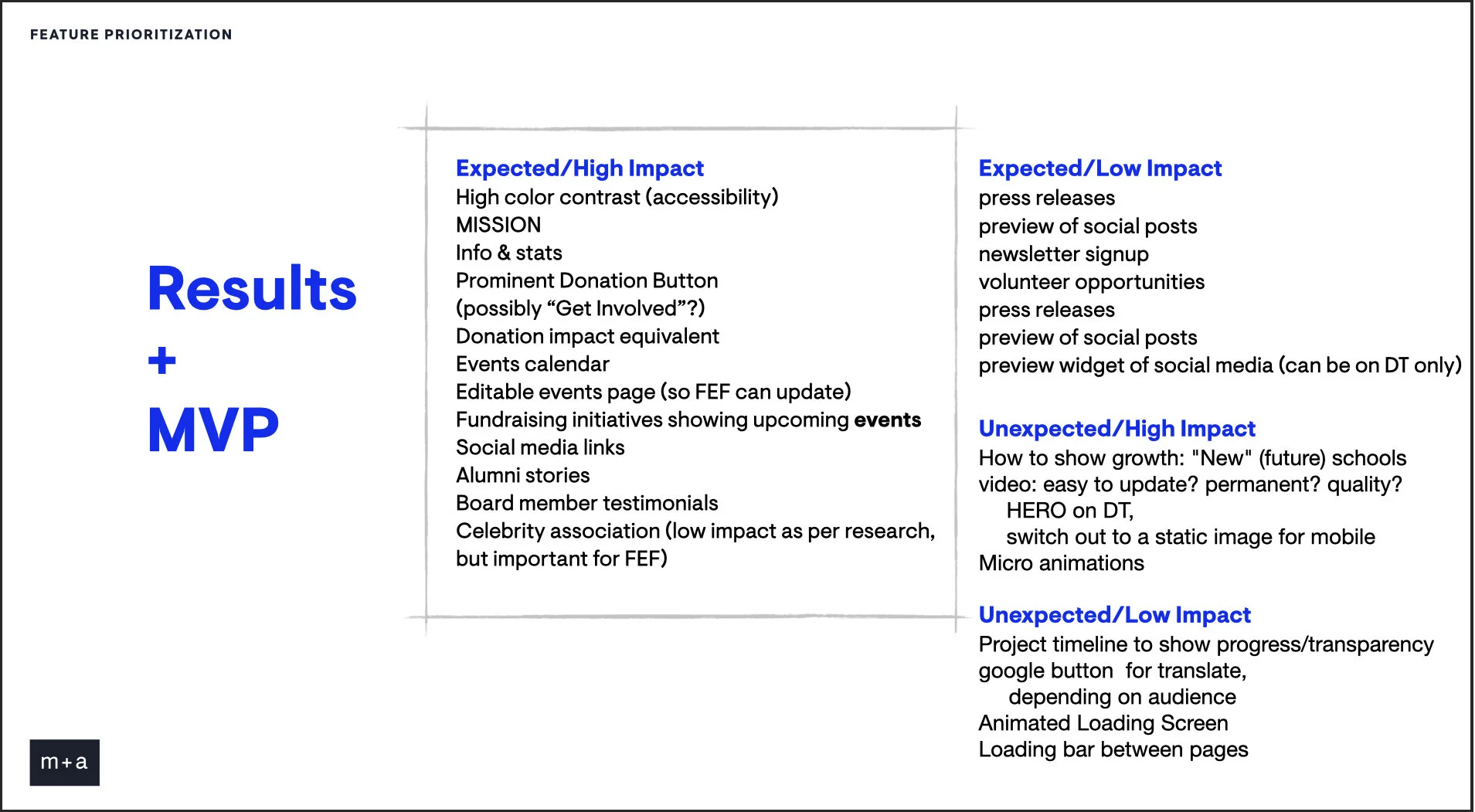
Remote Workshop Facilitation: Feature Prioritization
Method: Remote collaboration, 2x2 matrix
Deliverable: MVP features
The next step in our process happened during the Covid-19 lockdown in New York City. Once again, I pulled together a team of visual designers and our developer and carefully reviewed the features that users found most important. We collaborated on a shared whiteboard using Invision Freehand. The criteria were High/Low Impact and Expected/Unexpected. For my colleagues, this was the first time they had collaborated in real time and we all enjoyed the experience. The resulting High Impact/Expected features would be our concentration for an MVP website launch.

NEXT STEPS
As New York City was put on “PAUSE” due to quarantine lockdown, so has this story paused. I would hope our next steps will include low-fi wireframes, usability testing, iterations, and increased fidelity prototypes of the User Interface.